CREATION
About Tour de la Lune
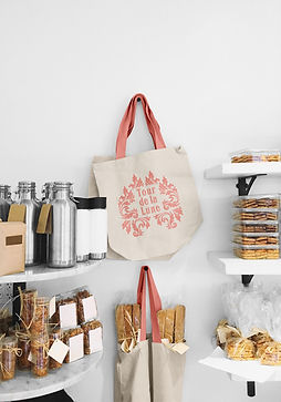
For the Tour de la Lune project, I was tasked with creating a brand as well as potential interior and exterior designs. This French patisserie in Austin, Texas, inspired me to blend the iconic Eiffel Tower motif with the historic Moonlight Towers of Austin, leading to the creation of Tour de la Lune, or Tower of the Moon.
I aimed for a very ornate, art nouveau feel in the branding, which is evident in the logo and decorative patterns. Additionally, I infused my love for painting into the project by illustrating the interior and exterior designs of Tour de la Lune with watercolors.
This project allowed me to merge my favorite styles and techniques in a unique way. Despite the challenges, the finished product was well worth the effort, capturing the essence of both Parisian elegance and Austin's unique charm.
CHALLENGE
Creating a Cohesive Online Presence
Creating the various touchpoint designs for Tour de la Lune was a complex and rewarding challenge. Developing cohesive branding for packaging, decor, menus, aprons, and more required meticulous attention to detail and a deep understanding of the brand's essence.
Each element had to harmonize with the ornate, art nouveau theme while also being practical and appealing. Designing packaging involved ensuring the visual appeal and functionality to enhance the customer experience. For decor, every piece had to complement the overall aesthetic and create an inviting atmosphere.
The aprons and other branded materials needed to be both stylish and functional, reflecting the patisserie's elegant yet approachable identity. Balancing creativity with consistency across all these touchpoints demanded thorough planning, innovative thinking, and a relentless commitment to quality, ultimately bringing the brand's vision to life in a seamless and enchanting way.


Interior & Exterior Design
Parisian Elegance with Austin Charm
Creating watercolor paintings for Tour de la Lune's interior and exterior design was a labor of love that allowed me to infuse the project with a personal artistic touch.
These paintings captured the essence of the patisserie's ornate, art nouveau aesthetic, blending Parisian elegance with Austin's unique charm. The interior illustrations featured intricate details of the patisserie's décor, from the delicate floral patterns to the sophisticated furniture, creating a warm and inviting atmosphere.
The exterior paintings showcased an iconic feminine/moon motif, establishing a striking and memorable facade. These watercolors not only served as design blueprints but also brought the brand's vision to life, illustrating the elegance and creativity that Tour de la Lune embodies.
BRANDING
Logo Variations


Primary Logo


Wordmark
Primary Logo - version 2
Wordmark - version 2

Icon/Submark

Icon/Submark - version 2


Secondary Logo
Secondary Logo - version 2
BRANDING

Type Pairings & Colorways


#17243F
Primary Colors


#92BAD5
#7C9CA6
#FFFFFF
#000000
Secondary Colors
Tertiary Colors

#A3BCC8

Social Media
Content Creation & Social Media Management
Creating the social media page for Tour de la Lune was a delightful and immersive experience. I focused on crafting a visual narrative that highlighted the unique charm of the French patisserie.
Incorporating images of the chef in action, baking exquisite pastries, helped to humanize the brand and showcase the craftsmanship behind each delicacy. I also included photographs of the ornate signage and my watercolor illustrations of the interior and exterior designs, which added an artistic touch and reinforced the brand's art nouveau theme.
Additionally, I shared snapshots of the intricate paintings and decorative patterns that adorned the patisserie, creating a cohesive and visually appealing feed. This approach not only engaged our audience but also conveyed the elegance and passion that define Tour de la Lune.


